


Since specialised sumi‑e papers and boards are pricey and hard to find outside Asia — and avoiding urauchi backing whenever possible is a bonus — I started testing more accessible surfaces to see how the ink would behave.
Here’s a quick look at how each one performed.
Quick Comparison Table
| Surface | How It Behaved | Notes |
|---|---|---|
| Calligraphy Paper (Daiso) | Mostly fine; unbleached ones performed better | Oblique flicks are tricky unless the brush is very wet |
| Canvas (Daiso) | Ink sits on top; grid texture shows | Crevices stay white and creates a pixelated look |
| Wooden Placemat (Kmart) | Faded immediately; grain visible | Rustic, ghostly effects but poor control |
| Shikishi Board (Daiso) | Good for bold strokes and gradients; poor absorption | Sumi‑e start‑stop and pause-to-spread techniques don’t work |

Calligraphy Paper from Daiso
This one was the closest to what I expected. The ink spreads in a familiar way, and the paper absorbs just enough to give those soft gradients sumi‑e is known for.
Where it gets tricky is with oblique brush flicks — those diagonal, fast strokes where you want the brush to glide and leave a tapered trail. On this paper, the brush needs to be very wet or the stroke catches and breaks. When the moisture is right, though, it behaves well enough for practice pieces.
Verdict: Good for general ink‑wash work, but temperamental with dynamic strokes.
Canvas from Daiso
This one surprised me, but not in a good way. The canvas has a noticeable grid texture, and the ink sits on top rather than sinking in. Instead of smooth gradients, you get a dotted, almost pixelated effect as the ink pools around the weave.
It’s interesting if you want a textured, experimental look, but it’s the opposite of what sumi‑e relies on — the whole technique depends on the paper absorbing and diffusing the ink.
Verdict: Fun for mixed‑media experiments, not great for sumi‑e.
Wooden Placemat from Kmart
This was the wild card. The ink fades quickly as it spreads, and the wood grain shows through everything. The result is a kind of ghostly, weathered effect — almost like the painting has already lived a life outdoors.
It’s not responsive enough for controlled brushwork, but the natural patterning of the wood adds its own personality. If you lean into that, it can be beautiful in a rustic, accidental way.
Verdict: Not suitable for traditional techniques, but the wood grain creates its own aesthetic.
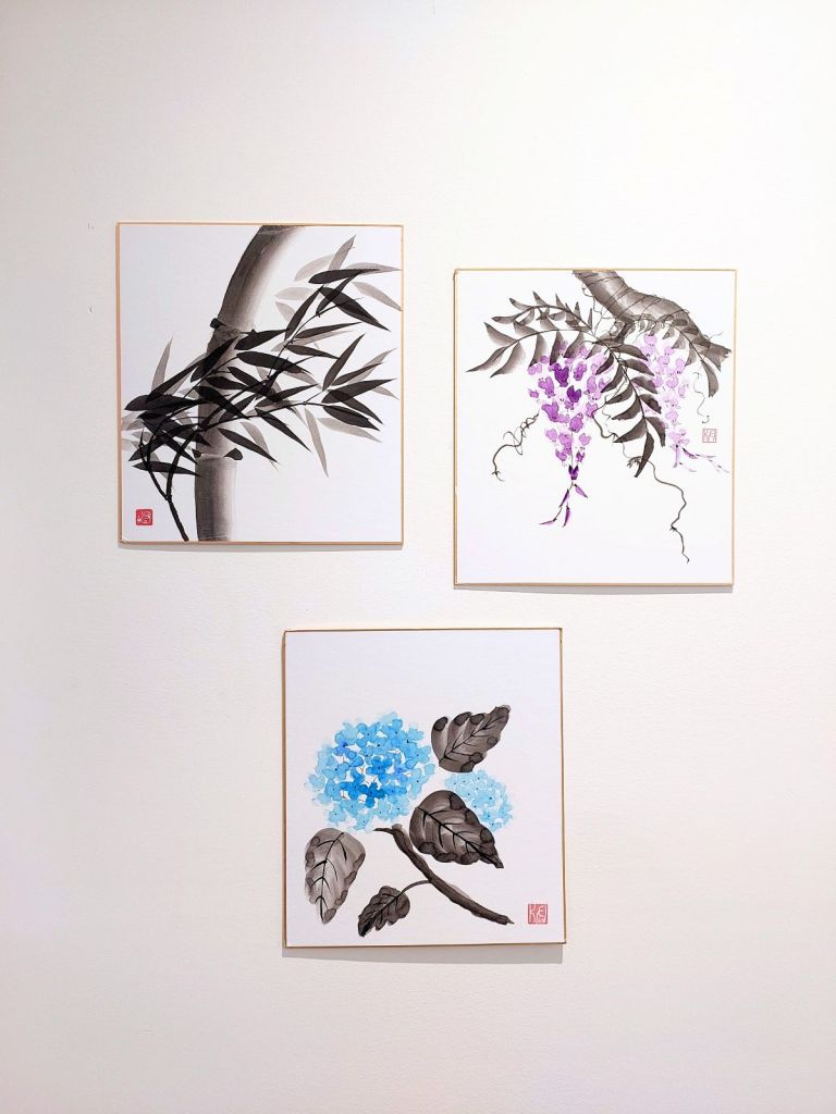
Shikishi Board from Daiso
Shikishi is usually used for calligraphy or more graphic brushwork, and that became obvious the moment I tried sumi‑e techniques on it.
It handles bold strokes and gradients fine, but anything involving start‑stop motion — pausing to let the ink bloom, or lifting the brush to create a dry‑brush fade — just doesn’t work. The surface is too sealed, so the ink sits on top instead of absorbing and spreading.
Verdict: Great for bold, confident strokes; not compatible with sumi‑e painting techniques.
Conclusion
After testing these surfaces, the calligraphy paper and the shikishi board from Daiso ended up being the most workable options, even with their limitations.
The shikishi is great if you want something you can put straight on the wall without doing urauchi backing, though it doesn’t really support true ink‑wash techniques since it’s essentially regular paper mounted on a board.
The calligraphy paper handles sumi‑e techniques much better, and if you want to display a finished piece, you can always back it afterward. (Iron‑on backing paper can make it easier.)
They’re not perfect substitutes for traditional materials made for ink wash paitning, but they’re affordable, accessible, and surprisingly capable for practice and simple display.




Leave a Reply